
35 Awesome Deviantart Web Designs Created In November 2010
Last month, we listed beautiful and popular web designs that can be found on Deviantart and we promised that each month we will feature awesome web designs. So now as promised, we will be featuring the best Deviantart web designs for the month of November. I bet you are all excited to see the latest uploads of web designs, scroll down and enjoy browsing these cool web interfaces!

This design is made for video conference experts.
This web design can be used for an e-commerce website. A nice work indeed!


The color is good, a color that represents coffee. Buttons on the top are beautiful as well as the logo. If the header is smaller, the whole design will look better.

 I hope that you enjoyed this list of web interfaces! If I missed your favorite, you may post it on the Comment section.
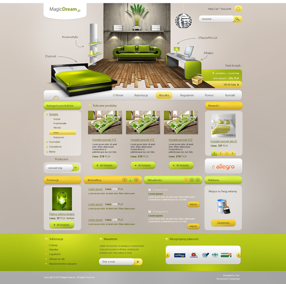
1. Magic Dream Site
by: carl913
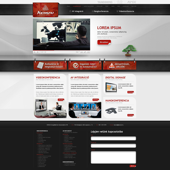
This green and refreshing look of web design can be used for furniture website, e-commerce or a website for an interior designing company.2. Kensai Web Design
by: VictoryDesign
I never thought that red, black and gray, when combined, would look good until I saw this web design. Great work!This design is made for video conference experts.
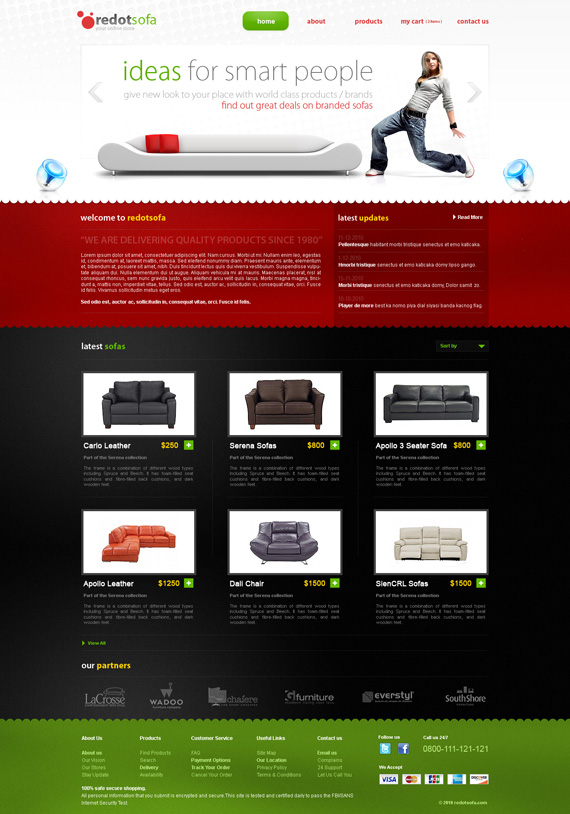
3. redotsofa
by: versesdesign
Who would have thought that black and red would look clean and professional when you match it on a white header? The footer also stands out in green.This web design can be used for an e-commerce website. A nice work indeed!
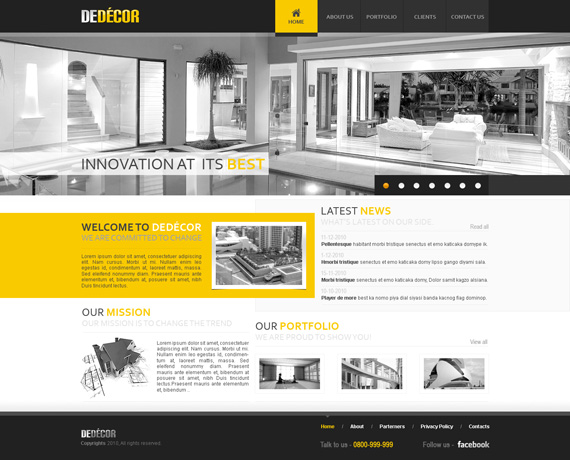
4. deDecor
by: versesdesign
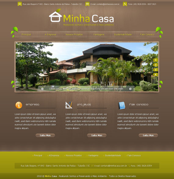
I like the navigation and also the black and white effect is good together with the yellow color. This really fits an interior decorator website, or a furniture shop.5. WEB: Minha Casa
by: =tupa169
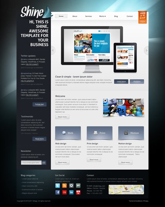
The color scheme is great, it really fits the kind of company or website it represents. If I were to suggest something on this design, I will make the navigation in a lighter Brown color to make it stand out from the rest. The logo is also good, very simple and clean.6. Shine – psd template
by: Shegystudio
I like the glowing effect of the background. Good design for the background, very simple and easy to understand. The color is somewhat dull and if the panel was put on the right side, it would look better, I guess.7. kellogg’s layout
by: cyrixDesign
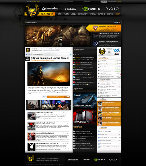
When I saw this design, it reminded me of how Kellogg’s taste so good. The way the creator placed the content is good and I find it user-friendly. Nice work indeed.8. PLAYZONE Gaming
by: hNsM
A web design created for a gaming zone site. The logo and the header are well-designed and the color reflects the purpose of the website. I also like the use of white background for the content part.9. AVG – eEvents
by: AntoniaVG
Putting the navigations on the top makes it easier for the viewers to use it. The choice of font is good, it gives a professional look on the design. By the way, the fish you see on the design is part of the company’s brand.10. Antojitos
by: sogaso
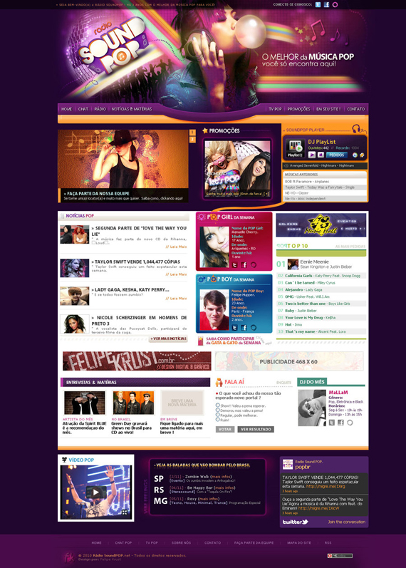
This made me crave for sweets! Good color combination, it really suits the whole design. I like how the food products are placed on a curved position, very simple yet stylish.11. Radio SoundPOP
by: felipekrust
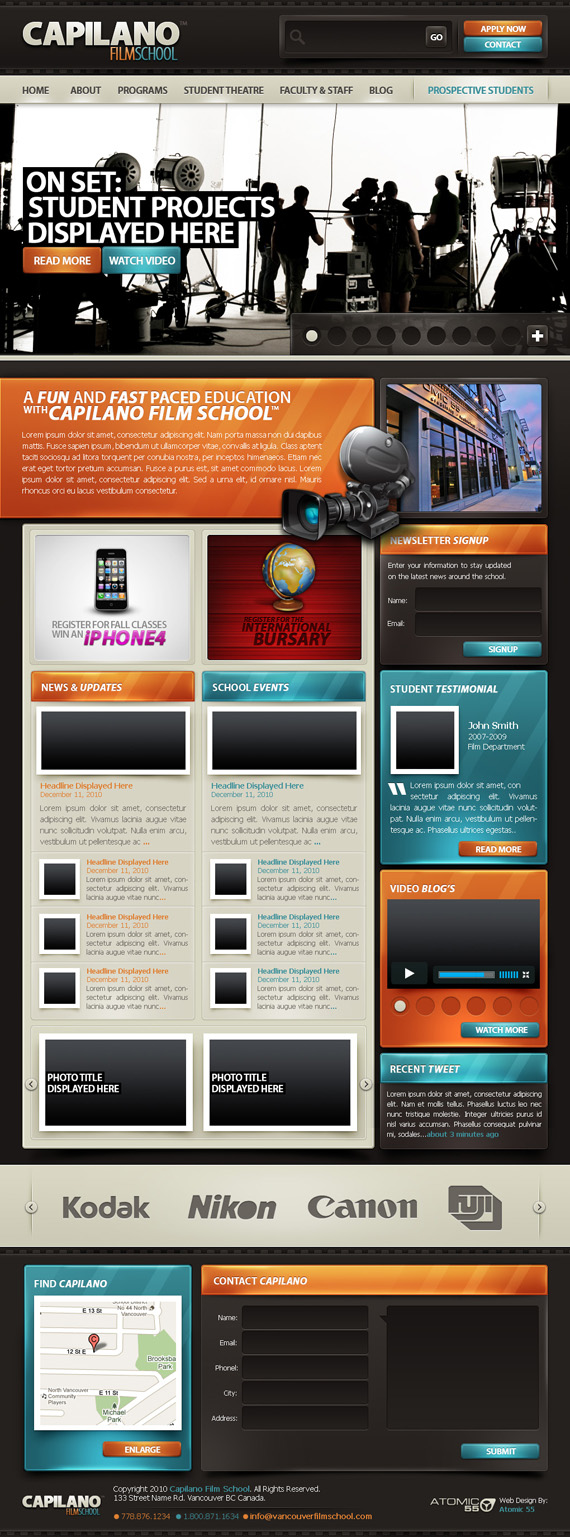
Nice header, very cool. It has great color combination and white space, too. I never thought orange and violet will look good for a template.12. Capilano Film School
by: LOUDAMedia
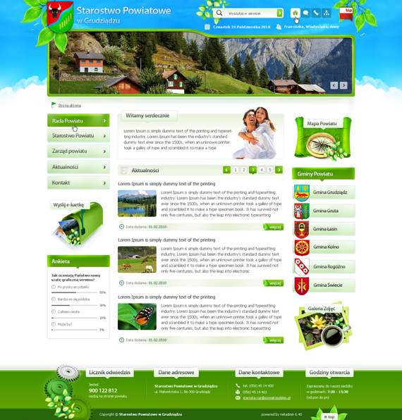
Great concept and good layout. Even there are a lot of contents on this page, it still looks organized and the blue and orange combination work well together. The problem that I just see here is that visitors might not like scrolling down to see the bottom part of the site.13. Starostwo powiatowe Grudziadz
by: pcholewa
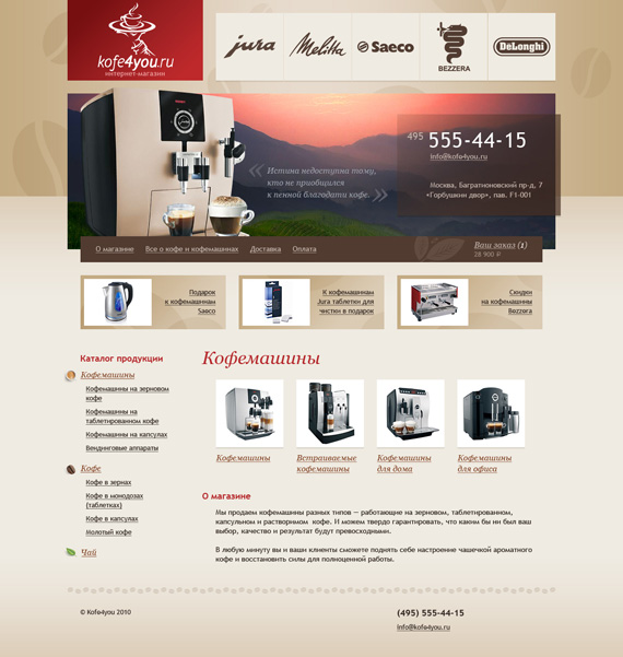
When I was searching for good web designs, this one struck me a lot because of the green and blue color it has. Also, the contents are well-placed and very organized. The footer is also well-designed, as well as the buttons on the top-right part of the interface.14. Online shop “Coffee for you”
by: lakinkleyThe color is good, a color that represents coffee. Buttons on the top are beautiful as well as the logo. If the header is smaller, the whole design will look better.
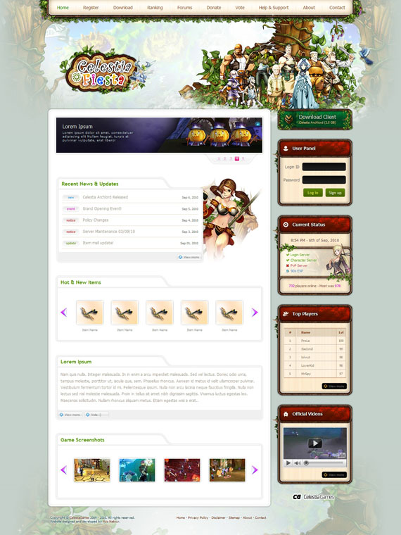
15. Celestia Fiesta
by: AzizNatour
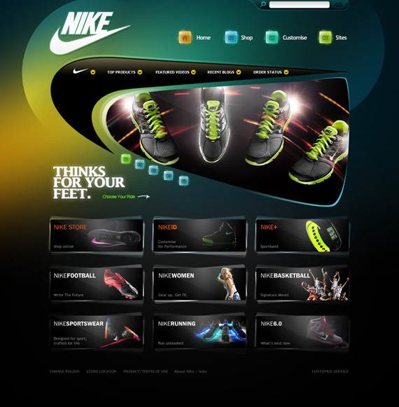
This one is very nice. It has a catchy header and very creative to put leaves as the outline border of the navigations. Also, the white space is good and the boxes makes the elements of this design look organized.16. nike
by: gdnz
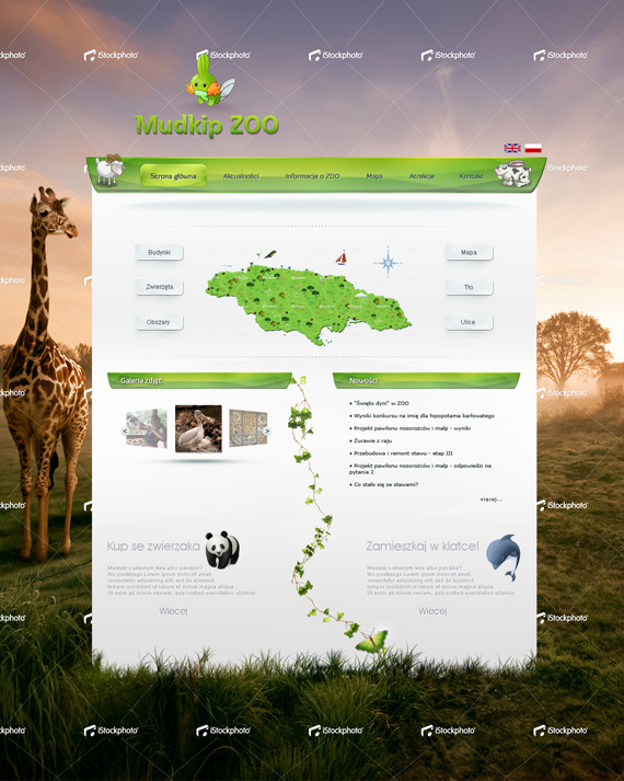
Attractive background and beautiful icons. The color combination suits on where the design can be used for.17. Zoo
by: Sagim
Nice idea to put an image as the background and the white space fits well in its place. Also, it has cute icons and choice of colors too. I just have one concern here, that is if the background image will fit all sizes of viewers’ monitor.18. Portfolio II
by: clackographix
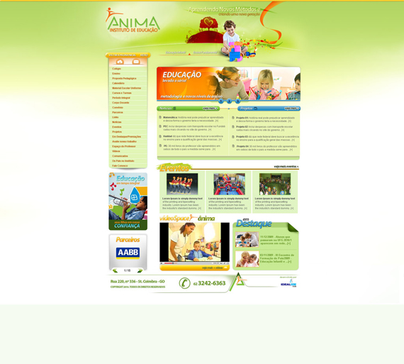
The fonts are nice and the choice of colors too. I like the panel that is hovering over an empty space and header of this design. One thing I can suggest is to transfer the buttons into different place on the design or make them more noticeable.19. Anima School
by: digitalgraphics
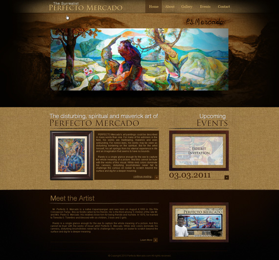
This designs fits a website dedicated for children. The color makes it nice to look at and the baby on the header is very cute, so attractive.20. D’ Surrealist Perfecto Mercado
by: bojok-mlsjr
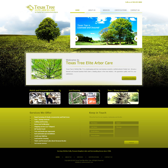
This design is dedicated for a Filipino artist. The choice of color fits the purpose of the website well and the header is very nice. I can say that this is also a good work of art.21. Texas Tree
by: shenkouhei
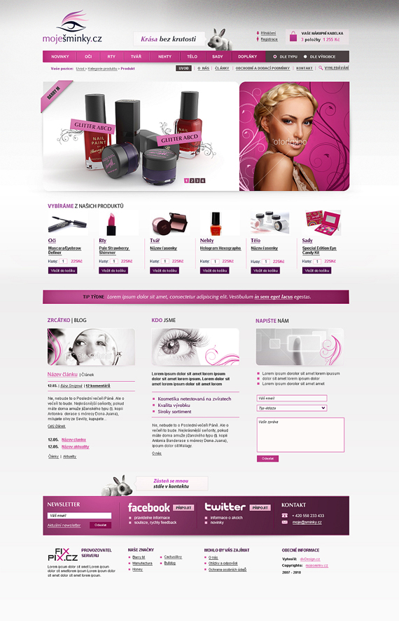
A website template that is made using Fireworks. Thumbs up for the hard work and for the design too. Very clean and fresh.22. MojeSminky.cz
by: Nikol-Kokesova
The logo is very stylish and the color is appropriately used on the design. All elements are well-placed to give viewers comfort in exploring the website.23. Lion Global
by: Xiphoid-Dezignz
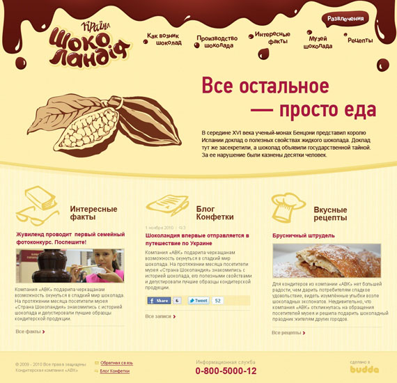
A web design created for an investor company. Very nice header and navigations. Also, good choice of fonts and the way to make the contents look organized.24. Chocoland
by: king-pavian
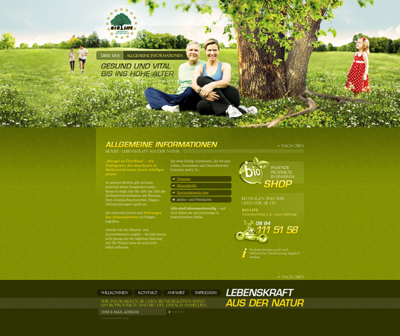
It has a very nice logo and icons too. So creative to put a pouring chocolate on top that can make viewers crave for sweets and explore the site more.25. Bio Life
by: LoCoFR
I find this web design so calm that it does not hurt my eyes even if I stare on to it longer. Overall, the design would look better if the header is smaller in height.26. Hums.co.cc Design
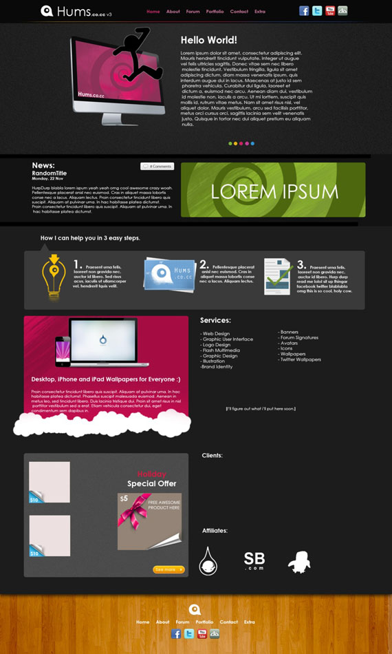
by: ChrisVme
The design is simple and the way contents are placed makes it very stylish and look groovy. This can be used for an outsourcing company or for a portfolio maybe.27. Soil Plus
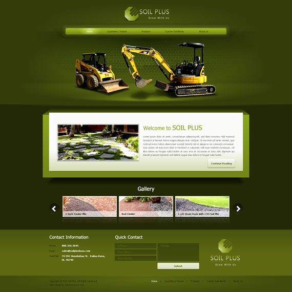
by: shenkouhei
The color scheme is good, but it would be better if the white box that is dedicated for the content was made larger in size to make it stand out since it is where content is placed.28. Orhideea ECO SPA
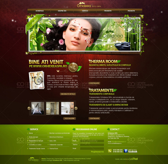
by: exodro
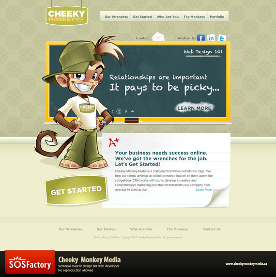
This web design that is dedicated for a spa website looks so refreshing with the color combination it has. Also, the contents that are put in a grid-based layout informs the viewers on what to expect on the website itself.29. Cheeky Monkey Media
by: sergitosuanez
The monkey is really cheeky! And the chalkboard is very nice too. All elements work well together making it absolutely nice.30. Alexis Jordan 2nd Version
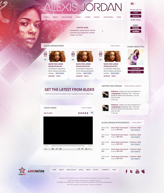
by: manya
A simple yet awesome design! The elements are well put in place and very nice header to put in a diagonal like position. I also noticed that there are two navigations, this makes viewers to easily explore wherever they are on the site.31. Grafica Progresso
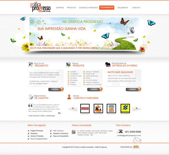
by: kaedesign
The white with a touch of orange makes it looks so clean and simple. The banner is creative and the gray buttons too, they gives life to the whole design. I also like how the contents were put into place, looks really organized.32. zee7 v. 1
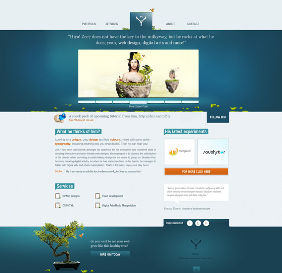
by: zee7
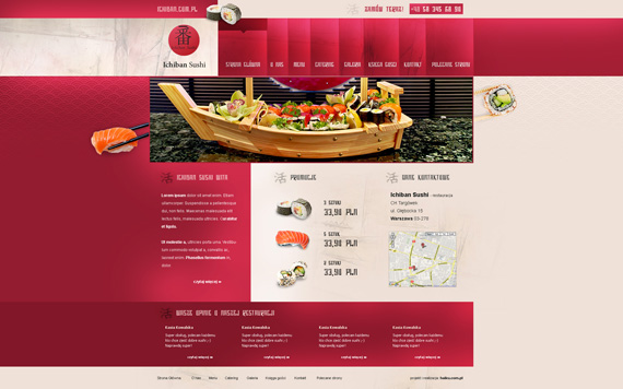
The one is well-designed from the color combination up to the choice of fonts and navigations. It looks so refreshing!33. ichiban sushi
by: PapciuZiom
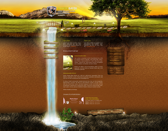
Nice choice of colors, it works well together. The contents are put in an organized way and nice design for the navigation. Great work!34. Martin Bayer
by: Carl06
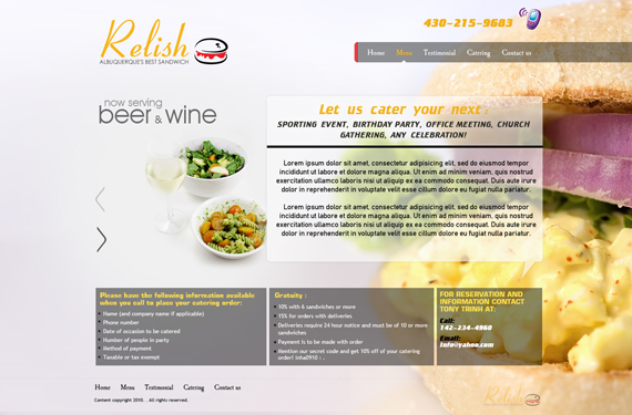
Very nice template and the falls is awesome! The whole design is simple but very attractive.35. Sandwich
by: preet618
Nicely done and the background makes me drool and crave for it. The texts are readable and good idea to put divisions with the use of square for the contents. Also, I like the concept where you can see their products when arrows are clicked.
35 Awesome Deviantart Web Designs Created In November 2010
![35 Awesome Deviantart Web Designs Created In November 2010]() Reviewed by BloggerSri
on
4:31 AM
Rating:
Reviewed by BloggerSri
on
4:31 AM
Rating:
No comments:
Post a Comment