22 Examples of Fixed Position Navigation in Web Design
Navigation might be the most important aspect of a website. It allows users to move from page to page and to find the content we want them to see. So having a navigation that is unique and always in the same position can be a huge plus. For this article, we gathered a few examples of websites that decided to use fixed position navigation. From fixed menus to headers and side bars, you will see several inspiring examples of how to use fixed navigation.








Nizo
While every element moves, the iPhone is fixed.
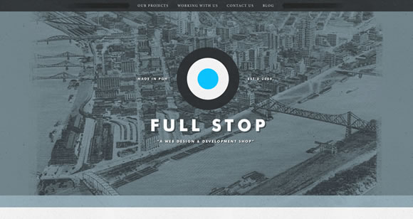
Full Stop
Here the fixed element is the header.
teehan+lax
Fixed side bar.
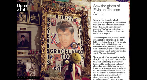
Up on a Hill
While you scroll up and down or use the navigation menu, the ‘Up on a Hill’ is always there, at the same position.
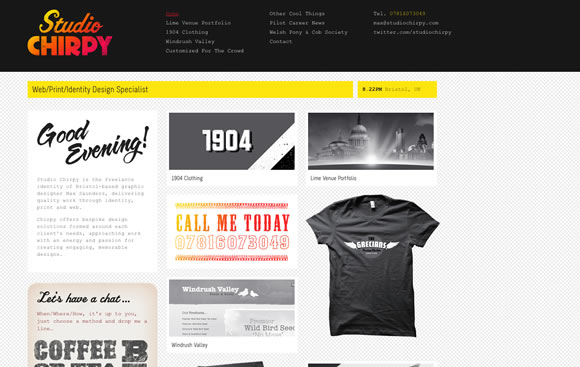
Studio Chirpy
Another example of fixed header.
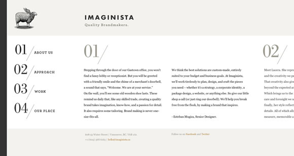
Imaginista
Here, while you browse content horizontally, header and side bar are fixed.
More than HTML5
The small header is always there, helping you to remember where you are while you browse the content.
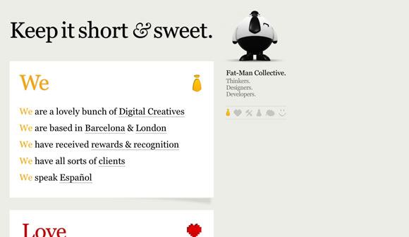
Fat-Man Collective
Check out the content and be sure to have side bar and mascot with you all times
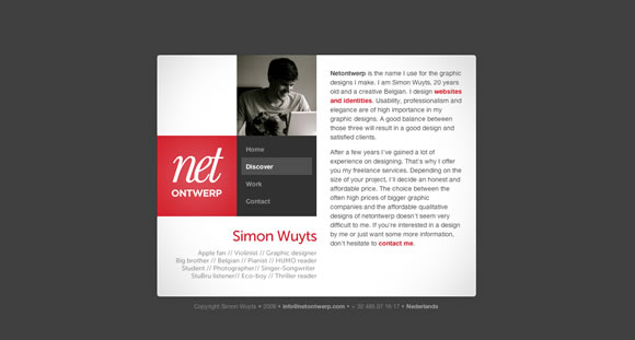
Netontwerp
Check out the content while side bar remains still.
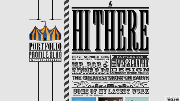
robedwards.org
Another good example of fixed side bar.
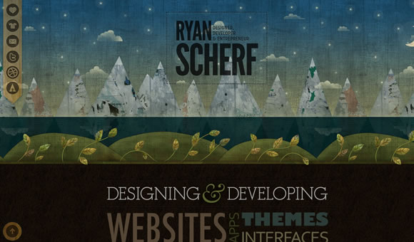
Ryan Scherf
Nice textured fixed menu.
Loysel’s Toy
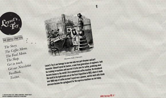
Another example of a side bar that stick around while you browse the content.
The Lit Pub
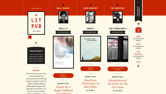
Also a fixed side bar.
Nudge
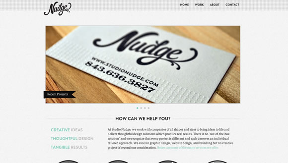
Beautiful fixed header.
Grow Media
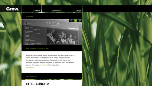
Here you can scroll content around while background and header bar remain still.
Bullet PR
Fixed menu!
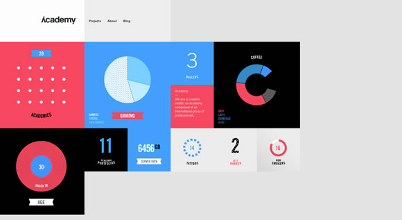
Academy
Also a beautiful and clean fixed header/menu.
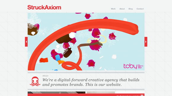
StruckAxiom
Check out the content and be sure to have side bar and mascot with you all times
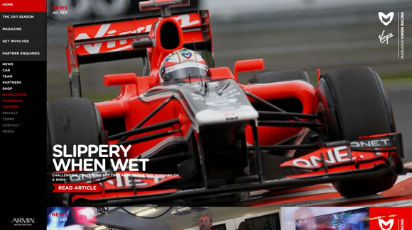
Virgin Racing
Browse beautiful huge colorful pictures while the side bar stay still to help your navigation.
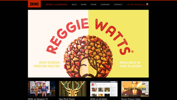
DKNG
Also an example of fixed header.
Rich Brown
Here the side bar/menu are fixed.You have the right side of the page to check out content while the left side stay still.
IGN
When you start scrolling down the menu bar will move to the top and of the page and will remain there while you check everything else.
22 Examples of Fixed Position Navigation in Web Design
![22 Examples of Fixed Position Navigation in Web Design]() Reviewed by BloggerSri
on
11:03 PM
Rating:
Reviewed by BloggerSri
on
11:03 PM
Rating:

1 comment:
Well, these designs are eye catching which can make the website to generate leads, generally these are the custom web design which has the aim for lead generation.
Post a Comment