Convert Your Product Landing Page From PSD to HTML [Very Detailed]
In this article you will learn how to convert Your Product Landing Page from PSD to HTML in a detailed step-by-step tutorial. You will learn how to create this layout by using a CSS framework, some CSS styles and Javascript. When you’ve completed this tutorial you’ll have a valid HTML/CSS, cross browser compatible and dynamic layout. I hope that you can go through this tutorial and learn a few techniques that will help you in future projects.
![Convert Your Product Landing Page From PSD to HTML [Very Detailed]](http://www.1stwebdesigner.com/wp-content/uploads/2011/02/preview_large_boxgen.jpg)
Now, let’s get started with this tutorial.
Links you will need to complete this tutorial:
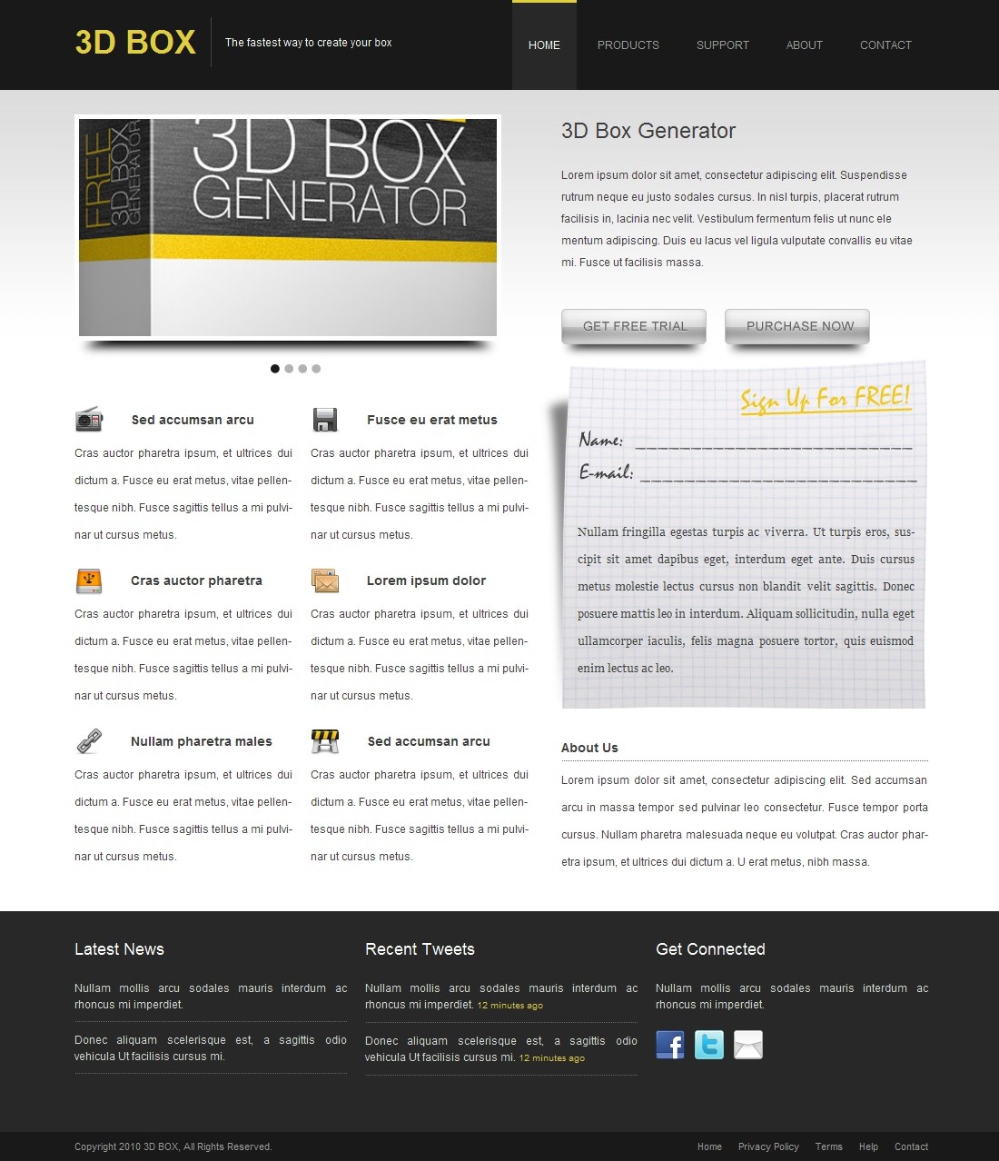
Here’s what we’ll be creating (Click on image to view a full working demo).
You can also download this tutorial’s source files here.
You will also need a code editor; you can use a plain text editor such as the Notepad. I always recommend you use a free code editor and get used to it, this helps you get things done faster.
During this tutorial you should test your layout in different browsers, you don’t want to return to the beginning because of browser compatibility issues. In this tutorial I am using some CSS3 styles, but as you might know not all browsers support CSS3 features. The CSS3 styles used in this tutorial have been tested with Firefox version 3.6.
Now you need to grab the CSS files from the 960gs grid system we downloaded earlier, extract the ZIP file and then copy the CSS files from /code/css/ folder to your /styles/ directory, you should copy 960.css, reset.css and text.css files. You should notice a directory called /uncompressed/ which has the same files but in a bigger and more readable format, I recommend using the compressed CSS files. You also need to create a new file in your root directory called index.html and create another file called style.css in /styles/ directory.
In this tutorial we need to export images from Photoshop to use in our HTML layout. You can export these images yourself if you have the layered PSD file from the original Photoshop tutorial, or you can just grab the source files with this tutorial and you’ll find the images I created.
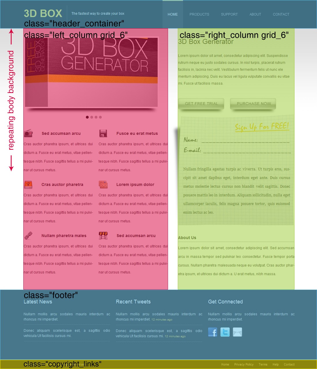
Now, Based on these notes we create the following HTML layout.
Notice in this simple layout that we added four main divisions. A division with class “header_container” containing a division with a class “container_12″ which is already styled in 960.css file and we use it to limit the layout width and center it horizontally in the page. Then a division with class “container_12″ that contains two columns a division with class “left_column grid_6″ and another one with class “right_column grid_6″ and we add the “grid_6″ class name because we want our division to have all the styling required to match the containing division and because both columns has nearly the same width which will be reset in the “left_column” and “right_column” classes to match our required widths. Then we added a division with class “footer” containing a division with class “container_12″. Finally, we added a division with class “copyright_links” containing a division with a class “container_12″. Now let’s add the CSS as follows (all CSS should be added in style.css file):
In the above CSS code we started by styling the body with color set to #403f3f, background color to #fff, background image to “bg.jpg” horizontally repeating, set background vertical position to 100px to start the background just after the header, font size to 12px and font family to Arial. Then we set all links to have no text decoration. Now we set “header_container” style with 100% width to fill all the browser’s visible area, background color to #191919, a fixed height of 100px, overflow to hidden so that all header extra content is hidden and a bottom margin of 27px. Now we need to reset the left and right column widths and margins, we set left column to have 500px width and 5px right margin, and the right column to have 404px width and 5px left margin with an extra left padding of 26px. Now let’s style the footer division with 100% width, a height of 215px, background color to #282828, text color to #d9d9d9 and a top padding of 28px.
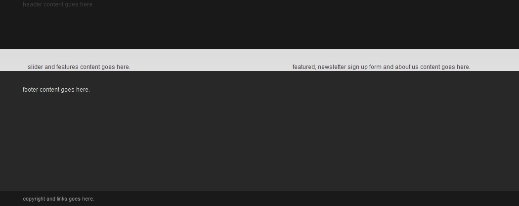
Finally, we style the copyright division with 100% width, a fixed height of 32px, background color to #191919, text color to #9e9e9e, line height to the same as height so that the text is aligned to center vertically and font size to 11px. The result should be the same as the image below.
Now, we added two divisions one for the logo with class “grid_5″ and one for the menu items with class “grid_7″. The logo text is added inside
with the slogan added inside a division with class “slogan”. The menu item links are added inside a division with class “menu”. Now lets add the CSS for the header content.
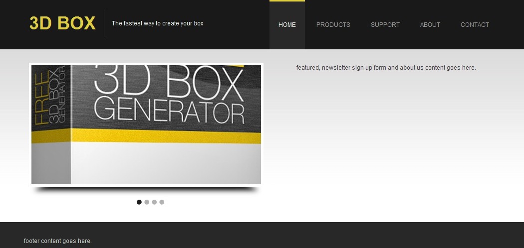
by setting display to block, top margin to 20px, line height to 55px, width to 150px, height to 55px, set floating to left and a right border of 1px with a color of #414141 to represent the vertical separator between the logo and the slogan. Then I styled the logo’s link with the color set to #e0cf39 and font size to 36px. Now we style the slogan by setting display to block, floating to the left, text color to white, a fixed height of 55px, line height similar to height to center text vertically, top margin of 20px and left margin of 15px. Let’s style the menu items, we start by styling the menu items container by setting float to right and display to block. Now we style the links normal state for menu items by setting text color to #9e9e9e, display to block, float to left, a fixed height and line height similar to the header height, a left and right padding of 18px and a left margin of 5px. Finally, we style the links hover and active states for the menu items by setting background color to #282828, text color to white, a 4px wide solid top border with a color of #e0cf39, height and line height to 96px to compensate for the 4 pixels taken by the top border. The result should be as the image below.
The script is so easy to use and modify that I only needed to add a division with class “slider” that contains another division with an ID “slider” which will be used by the script to make the slider works. Then the slides is simply a division with an image inside, that I added it 4 times inside the division “slides_container”. Now let’s add the CSS style for the slider content and script.
The slider division is styled with a background image to represent the shadow underneath the slider, a fixed height and width and a bottom margin of 34px. Then I styled the slides container with fixed height and width, display set to none and a 5px solid white border. Now we style the divisions holding the images with fixed height and width and display set to block. Now you notice that there’s a style for something called pagination, and this style is for a content added by the script after the slides to represent the paging navigation for the slides. I styled it so that it is now represented by a background circle image for normal, hover and current states.
Now let’s add the required jQuery script in the header. You can find the script file in this tutorial source file or from the jQuery Scrollable script page. The HTML head section should be like this.
Finally, we need to add the Javascript code that will allow the slider to work on our layout. You should add this script just before the closing tag of the body. Here’s the Javascript.
Now our layout should look like this.
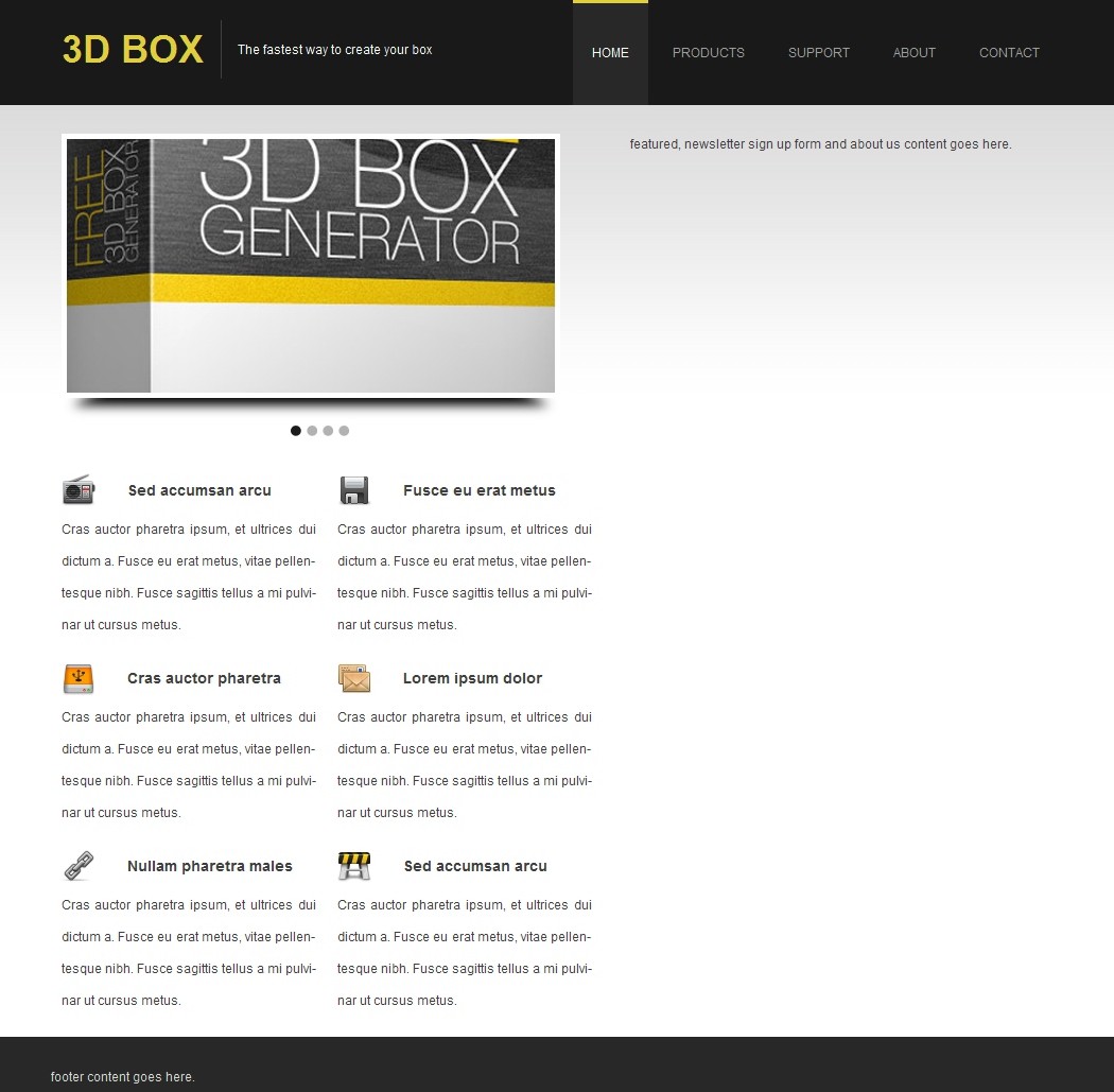
Now if you take a look at the HTML above you will notice that there’s a pattern of two three divisions repeated three times, a division with class “features_item”, a division with class “features_item with_margin” and a final division with class “clear” for clearing floated elements. Every division has an
tag with the icon image inside it, and then a paragraph. Now let’s add the CSS style for the features content.
We added a
tag with a title inside it, a paragraph and then two links which will represent “Purchase Now” and “Get Free Trial” buttons. Now we need to style the featured content, here’s the CSS styles.
I added a division with class “newsletter” which will act as a container for form elements, inside it I added a link for the “Sign Up For FREE” then two text inputs for name and email and finally a paragraph. Now let’s add the CSS style for the newsletter sign up form.
If you look at the full layout image you’ll probably notice that the sign up form’s background image is not aligned with the content and in order to do this we are going to use negative margins which will allow us to expand the sign up form background image as we like. We styled the newsletter division with a background image, background position, a fixed height and width, positive left padding equal to the negative left margin, bottom margin and clear set to both to clear all floated elements. Now we set the “Sign Up For FREE” link style with fixed width and height, floating to right, negative text indentation to hide the text and some top, right and bottom margins. Let’s style the the text input general style with fixed height and width, line height to a value equal to height to center text vertically, background set to transparent and with no border. for the name and email text inputs style I added some margins to place them right where we need. Finally, I styled the paragraph with font family to Georgia, line height to 30px, text align to justify, top margin to 40px, right margin to 14px and left margin to 18px. The result should be as the image below.

I added a
tag then paragraph with some text, now let’s add the CSS style for About Us content.
I used three divisions with class “grid_4″ which will divide the footer into three equal sections, the first one has an
tag, a paragraph and the social icons links and images. Now, let’s add the CSS style for the footer content.
I added two divisions with class “grid_4″ for copyright text and “grid_8″ for the links. Now let’s add the CSS style.
First I set “grid_4″ text alignment to left and “grid_8″ to right, and then I styled the links with color set to #9e9e9e and a left margin of 15px.
If you followed this tutorial correctly then you should have a full working HTML/CSS layout from a PSD that looks exactly like this.

![Convert Your Product Landing Page From PSD to HTML [Very Detailed]](http://www.1stwebdesigner.com/wp-content/uploads/2011/02/preview_large_boxgen.jpg)
Now, let’s get started with this tutorial.
Links you will need to complete this tutorial:
Here’s what we’ll be creating (Click on image to view a full working demo).

You can also download this tutorial’s source files here.
Step 1 – Preparation
If you read the Photoshop tutorial for creating this landing page you probably noticed that 960gs grid system was used to create guidelines. Well, in this tutorial we will also need the 960gs CSS framework. Using CSS frameworks makes layout and style creation a lot easier and saves time in web development. Now you should download the 960 Grid system source files for usage in this tutorial.You will also need a code editor; you can use a plain text editor such as the Notepad. I always recommend you use a free code editor and get used to it, this helps you get things done faster.
During this tutorial you should test your layout in different browsers, you don’t want to return to the beginning because of browser compatibility issues. In this tutorial I am using some CSS3 styles, but as you might know not all browsers support CSS3 features. The CSS3 styles used in this tutorial have been tested with Firefox version 3.6.
Step 2 – Getting Your Files Ready
First thing you should do is create a directory for your website. I usually create an /images/ directory for images and a /styles/ directory which will hold every style sheet (CSS) file and the slider JavaScript file. The HTML file goes in the root directory.Now you need to grab the CSS files from the 960gs grid system we downloaded earlier, extract the ZIP file and then copy the CSS files from /code/css/ folder to your /styles/ directory, you should copy 960.css, reset.css and text.css files. You should notice a directory called /uncompressed/ which has the same files but in a bigger and more readable format, I recommend using the compressed CSS files. You also need to create a new file in your root directory called index.html and create another file called style.css in /styles/ directory.
In this tutorial we need to export images from Photoshop to use in our HTML layout. You can export these images yourself if you have the layered PSD file from the original Photoshop tutorial, or you can just grab the source files with this tutorial and you’ll find the images I created.
Step 3 – Simple Starter Layout
We need to start by creating a Simple HTML layout as the basis of our site to be. By looking at the Photoshop Layout you should notice a few things:- The layout has a background image for the body that is repeated horizontally.
- The layout has a header which contains a logo, slogan and menu items.
- The content of the layout is separated into two columns: the left column contains slider and features, while the right column contains a featured section with two buttons, newsletter sign-up form and about us text.
- The bottom section of the layout has two sections a footer with latest news, latest tweets and get connected social icons, and a copyright section with copyright text and links.
- Finally, all divisions have a background color and no background image.

Now, Based on these notes we create the following HTML layout.
1 | "-//W3C//DTD XHTML 1.0 Transitional//EN" "http://www.w3.org/TR/xhtml1/DTD/xhtml1-transitional.dtd"> |
3 | |
4 | |
5 | |
6 | |
7 | |
8 | |
9 | |
10 | |
11 | |
12 | class="header_container"> |
13 | class="container_12"> |
14 | header content goes here. |
15 | |
16 | |
17 | class="container_12"> |
18 | class="left_column grid_6"> |
19 | slider and features content goes here. |
20 | |
21 | class="right_column grid_6"> |
22 | featured, newsletter sign up form and about us content goes here. |
23 | |
24 | class="clear"> |
25 | |
26 | class="footer"> |
27 | class="container_12"> |
28 | footer content goes here. |
29 | |
30 | |
31 | class="copyright_links"> |
32 | class="container_12"> |
33 | copyright and links goes here. |
34 | |
35 | |
36 | |
37 | |
1 | body { |
2 | color: #403f3f; |
3 | background: #fff url(../images/bg.jpg) repeat-x; |
4 | background-position: center 100px; |
5 | font-size: 12px; |
6 | font-family: Arial; |
7 | } |
8 |
9 | a { |
10 | text-decoration: none; |
11 | } |
12 |
13 | .header_container { |
14 | width: 100%; |
15 | background: #191919; |
16 | height: 100px; |
17 | overflow: hidden; |
18 | margin: 0 0 27px 0; |
19 | } |
20 |
21 | .container_12 .left_column { |
22 | width: 500px; |
23 | margin-right: 5px; |
24 | } |
25 |
26 | .container_12 .right_column { |
27 | width: 404px; |
28 | padding: 0 0 0 26px; |
29 | margin-left: 5px; |
30 | } |
31 |
32 | .footer { |
33 | width: 100%; |
34 | height: 215px; |
35 | background: #282828; |
36 | color: #d9d9d9; |
37 | padding: 28px 0 0 0; |
38 | } |
39 |
40 | .copyright_links { |
41 | width: 100%; |
42 | height: 32px; |
43 | background: #191919; |
44 | color: #9e9e9e; |
45 | line-height: 32px; |
46 | font-size: 11px; |
47 | } |
Finally, we style the copyright division with 100% width, a fixed height of 32px, background color to #191919, text color to #9e9e9e, line height to the same as height so that the text is aligned to center vertically and font size to 11px. The result should be the same as the image below.

Step 4 – Adding Logo and Menu Items to Header
Now we need to add the logo and menu items, here’s the HTML for the header section.1 | class="header_container"> |
2 | class="container_12"> |
3 | class="grid_5"> |
5 | class="slogan">The fastest way to create your box |
6 | |
7 | class="grid_7"> |
8 | class="menu"> |
14 | |
15 | |
16 | |
17 | |
with the slogan added inside a division with class “slogan”. The menu item links are added inside a division with class “menu”. Now lets add the CSS for the header content.
1.header_container {
2 width: 100%;
3 background: #191919;
4 height: 100px;
5 overflow: hidden;
6 margin: 0 0 27px 0;
7}
8
9 .header_container h1 {
10 display: block;
11 margin: 20px 0 0 0;
12 line-height: 55px;
13 width: 150px;
14 height: 55px;
15 float: left;
16 border-right: 1px solid #414141;
17 }
18
19 .header_container h1 a {
20 color: #e0cf39;
21 font-size: 36px;
22 }
23
24 .header_container .slogan {
25 display: block;
26 float: left;
27 color: #fff;
28 height: 55px;
29 line-height: 55px;
30 margin: 20px 0 0 15px;
31 }
32
33 .header_container .menu {
34 float: right;
35 display: block;
36 }
37
38 .header_container .menu a {
39 color: #9e9e9e;
40 display: block;
41 float: left;
42 height: 100px;
43 line-height: 100px;
44 padding: 0 18px;
45 margin: 0 0 0 5px;
46 }
47
48 .header_container .menu a:hover, .header_container .menu a.active {
49 background: #282828;
50 color: #fff;
51 border-top: 4px solid #e0cf39;
52 height: 96px;
53 line-height: 92px;
54 }
I started by styling the
1 | .header_container { |
2 | width: 100%; |
3 | background: #191919; |
4 | height: 100px; |
5 | overflow: hidden; |
6 | margin: 0 0 27px 0; |
7 | } |
8 |
9 | .header_container h1 { |
10 | display: block; |
11 | margin: 20px 0 0 0; |
12 | line-height: 55px; |
13 | width: 150px; |
14 | height: 55px; |
15 | float: left; |
16 | border-right: 1px solid #414141; |
17 | } |
18 |
19 | .header_container h1 a { |
20 | color: #e0cf39; |
21 | font-size: 36px; |
22 | } |
23 |
24 | .header_container .slogan { |
25 | display: block; |
26 | float: left; |
27 | color: #fff; |
28 | height: 55px; |
29 | line-height: 55px; |
30 | margin: 20px 0 0 15px; |
31 | } |
32 |
33 | .header_container .menu { |
34 | float: right; |
35 | display: block; |
36 | } |
37 |
38 | .header_container .menu a { |
39 | color: #9e9e9e; |
40 | display: block; |
41 | float: left; |
42 | height: 100px; |
43 | line-height: 100px; |
44 | padding: 0 18px; |
45 | margin: 0 0 0 5px; |
46 | } |
47 |
48 | .header_container .menu a:hover, .header_container .menu a.active { |
49 | background: #282828; |
50 | color: #fff; |
51 | border-top: 4px solid #e0cf39; |
52 | height: 96px; |
53 | line-height: 92px; |
54 | } |
by setting display to block, top margin to 20px, line height to 55px, width to 150px, height to 55px, set floating to left and a right border of 1px with a color of #414141 to represent the vertical separator between the logo and the slogan. Then I styled the logo’s link with the color set to #e0cf39 and font size to 36px. Now we style the slogan by setting display to block, floating to the left, text color to white, a fixed height of 55px, line height similar to height to center text vertically, top margin of 20px and left margin of 15px. Let’s style the menu items, we start by styling the menu items container by setting float to right and display to block. Now we style the links normal state for menu items by setting text color to #9e9e9e, display to block, float to left, a fixed height and line height similar to the header height, a left and right padding of 18px and a left margin of 5px. Finally, we style the links hover and active states for the menu items by setting background color to #282828, text color to white, a 4px wide solid top border with a color of #e0cf39, height and line height to 96px to compensate for the 4 pixels taken by the top border. The result should be as the image below.

Step 5 – Adding Slider Content, Style and Javascript
Now, we are going to add the slider and for this I am going to use an already implemented script, which is Slidesjs. I did take the script and modified it to make it suit our layout and now here’s the HTML for the slider content which will be included inside the left column.1 | class="left_column grid_6"> |
2 | class="slider"> |
3 | "slider"> |
4 | class="slides_container"> |
5 | |
6 | |
7 | |
8 | |
9 | |
10 | |
11 | |
12 | |
13 | |
14 | |
15 | |
16 | |
17 | |
18 | |
19 | |
20 | |
1 | .container_12 .left_column .slider { |
2 | background: url(../images/slider.png) no-repeat bottom center; |
3 | width: 470px; |
4 | height: 286px; |
5 | margin: 0 0 34px 0; |
6 | } |
7 |
8 | .slides_container { |
9 | width:460px; |
10 | height: 239px; |
11 | display: none; |
12 | border: 5px solid #fff; |
13 | } |
14 |
15 | .slides_container div { |
16 | width: 460px; |
17 | height: 239px; |
18 | display: block; |
19 | } |
20 |
21 | .pagination { |
22 | list-style: none; |
23 | display: block; |
24 | padding: 0; |
25 | margin: 26px 0 0 216px; |
26 | float: left; |
27 | width: 60px; |
28 | } |
29 |
30 | .pagination li { |
31 | float: left; |
32 | margin: 0; |
33 | padding: 0; |
34 | } |
35 |
36 | .pagination li a { |
37 | height: 10px; |
38 | width: 10px; |
39 | float: left; |
40 | text-indent: -10000px; |
41 | background: url(../images/slider_bullets.png) no-repeat; |
42 | background-position: -15px center; |
43 | margin: 0 5px 0 0; |
44 | } |
45 |
46 | .pagination li a:hover { |
47 | background-position: 0px center; |
48 | } |
49 |
50 | .pagination .current a { |
51 | background-position: 0px center; |
52 | } |
Now let’s add the required jQuery script in the header. You can find the script file in this tutorial source file or from the jQuery Scrollable script page. The HTML head section should be like this.
1 | |
2 | |
3 | |
4 | |
5 | |
6 | |
7 | |
8 | |
9 | |
10 | |
1 | |

Step 6 – Adding Features Content and Style
We are still adding content inside the left column and now we need to add the features content right after the slider content, here’s the HTML.1 | class="features_item"> |
2 | |
3 | |
4 | Sed accumsan arcu |
5 | |
6 | |
7 | Cras auctor pharetra ipsum, et ultrices dui dictum a. Fusce eu erat metus, vitae pellen- tesque nibh. Fusce sagittis tellus a mi pulvi- nar ut cursus metus. |
8 | |
9 | |
10 | class="features_item with_margin"> |
11 | |
12 | |
13 | Fusce eu erat metus |
14 | |
15 | |
16 | Cras auctor pharetra ipsum, et ultrices dui dictum a. Fusce eu erat metus, vitae pellen- tesque nibh. Fusce sagittis tellus a mi pulvi- nar ut cursus metus. |
17 | |
18 | |
19 | class="clear"> |
20 | class="features_item"> |
21 | |
22 | |
23 | Cras auctor pharetra |
24 | |
25 | |
26 | Cras auctor pharetra ipsum, et ultrices dui dictum a. Fusce eu erat metus, vitae pellen- tesque nibh. Fusce sagittis tellus a mi pulvi- nar ut cursus metus. |
27 | |
28 | |
29 | class="features_item with_margin"> |
30 | |
31 | |
32 | Lorem ipsum dolor |
33 | |
34 | |
35 | Cras auctor pharetra ipsum, et ultrices dui dictum a. Fusce eu erat metus, vitae pellen- tesque nibh. Fusce sagittis tellus a mi pulvi- nar ut cursus metus. |
36 | |
37 | |
38 | class="clear"> |
39 | class="features_item"> |
40 | |
41 | |
42 | Nullam pharetra males |
43 | |
44 | |
45 | Cras auctor pharetra ipsum, et ultrices dui dictum a. Fusce eu erat metus, vitae pellen- tesque nibh. Fusce sagittis tellus a mi pulvi- nar ut cursus metus. |
46 | |
47 | |
48 | class="features_item with_margin"> |
49 | |
50 | |
51 | Sed accumsan arcu |
52 | |
53 | |
54 | Cras auctor pharetra ipsum, et ultrices dui dictum a. Fusce eu erat metus, vitae pellen- tesque nibh. Fusce sagittis tellus a mi pulvi- nar ut cursus metus. |
55 | |
56 | |
tag with the icon image inside it, and then a paragraph. Now let’s add the CSS style for the features content.
1.container_12 .left_column .features_item {
2 width: 240px;
3 float: left;
4}
5
6 .container_12 .left_column .features_item.with_margin {
7 margin-left: 20px;
8 }
9
10 .container_12 .left_column .features_item h3 {
11 font-size: 14px;
12 margin: 0 0 5px 0;
13 line-height: 32px;
14 }
15
16 .container_12 .left_column .features_item h3 img {
17 float: left;
18 margin: 0 30px 0 0;
19 }
20
21 .container_12 .left_column .features_item p {
22 line-height: 30px;
23 text-align: justify;
24 }
Notice that for the “features_item” class there’s two styles: “.container_12 .left_column .features_item” and “.container_12 .left_column .features_item.with_margin”, the difference between both styles is that one has no margins and the other one has a left margin of 20px. The features item class has a float to left and a fixed width. The header 3 is styled with 14px for font size, 5px bottom margin and line height of 32px. The image inside the header style is set to floating to left and right margin of 30px for the space between the image and the text. Finally, I styled the paragraph with 30px line height and text align is set to justify. Now our layout should look like this.
1 | .container_12 .left_column .features_item { |
2 | width: 240px; |
3 | float: left; |
4 | } |
5 |
6 | .container_12 .left_column .features_item.with_margin { |
7 | margin-left: 20px; |
8 | } |
9 |
10 | .container_12 .left_column .features_item h3 { |
11 | font-size: 14px; |
12 | margin: 0 0 5px 0; |
13 | line-height: 32px; |
14 | } |
15 |
16 | .container_12 .left_column .features_item h3 img { |
17 | float: left; |
18 | margin: 0 30px 0 0; |
19 | } |
20 |
21 | .container_12 .left_column .features_item p { |
22 | line-height: 30px; |
23 | text-align: justify; |
24 | } |
Step 7 – Adding Featured Content and Style
Now we need to add the featured content with buttons in the right column section. Here’s the HTML for the featured content.1 | 3D Box Generator |
2 | |
3 | Lorem ipsum dolor sit amet, consectetur adipiscing elit. Suspendisse rutrum neque eu justo sodales cursus. In nisl turpis, placerat rutrum facilisis in, lacinia nec velit. Vestibulum fermentum felis ut nunc ele mentum adipiscing. Duis eu lacus vel ligula vulputate convallis eu vitae mi. Fusce ut facilisis massa. |
4 | |
tag with a title inside it, a paragraph and then two links which will represent “Purchase Now” and “Get Free Trial” buttons. Now we need to style the featured content, here’s the CSS styles.
1.container_12 .right_column h2 {
2 font-size: 24px;
3 font-weight: normal;
4 margin: 0 0 18px 0;
5}
6
7.container_12 .right_column p {
8 line-height: 24px;
9 margin: 0 0 40px 0;
10}
11
12.container_12 .right_column .free_trial_button {
13 background: url(../images/buttons_form_bg.png) no-repeat;
14 background-position: -26px 0px;
15 height: 56px;
16 width: 160px;
17 float: left;
18 text-indent: -10000px;
19 margin: 0 20px 0 0;
20}
21
22.container_12 .right_column .purchase_now_button {
23 background: url(../images/buttons_form_bg.png) no-repeat;
24 background-position: -206px 0px;
25 height: 56px;
26 width: 160px;
27 float: left;
28 text-indent: -10000px;
29}
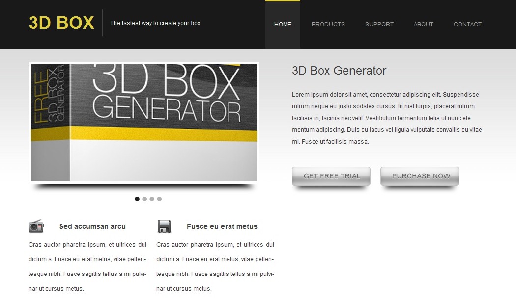
The style for header 2 is set to have font size of 24px, normal font weight and a bottom margin of 18px. The paragraph is styled to have 24px for line height and 40px as bottom margin. Now, we’ll style the buttons which have almost the same style, but with the free trial button having a right margin and different background position as we are using a CSS technique called CSS Sprites which allows us to choose what to show from a single image using CSS background position properties. The buttons classes style is set with background image that has no repeat, background position, a fixed height and width, floating to left and a text indent set to -10000px which allows the text to be available in the HTML but it is hidden when viewed in browsers and this has some SEO benefits. The result should be as the image below.
1 | .container_12 .right_column h2 { |
2 | font-size: 24px; |
3 | font-weight: normal; |
4 | margin: 0 0 18px 0; |
5 | } |
6 |
7 | .container_12 .right_column p { |
8 | line-height: 24px; |
9 | margin: 0 0 40px 0; |
10 | } |
11 |
12 | .container_12 .right_column .free_trial_button { |
13 | background: url(../images/buttons_form_bg.png) no-repeat; |
14 | background-position: -26px 0px; |
15 | height: 56px; |
16 | width: 160px; |
17 | float: left; |
18 | text-indent: -10000px; |
19 | margin: 0 20px 0 0; |
20 | } |
21 |
22 | .container_12 .right_column .purchase_now_button { |
23 | background: url(../images/buttons_form_bg.png) no-repeat; |
24 | background-position: -206px 0px; |
25 | height: 56px; |
26 | width: 160px; |
27 | float: left; |
28 | text-indent: -10000px; |
29 | } |
Step 8 – Adding Newsletter Sign Up Form HTML and CSS
Now let’s add the HTML for the Newsletter sign up form.1 | class="newsletter"> |
3 | class="clear"> |
4 | |
5 | |
6 | |
7 | Nullam fringilla egestas turpis ac viverra. Ut turpis eros, sus- cipit sit amet dapibus eget, interdum eget ante. Duis cursus metus molestie lectus cursus non blandit velit sagittis. Donec posuere mattis leo in interdum. Aliquam sollicitudin, nulla eget ullamcorper iaculis, felis magna posuere tortor, quis euismod enim lectus ac leo. |
8 | |
9 | |
1 | .container_12 .right_column .newsletter { |
2 | background: url(../images/buttons_form_bg.png) no-repeat; |
3 | background-position: 0px -63px; |
4 | height: 384px; |
5 | width: 403px; |
6 | padding: 0 0 0 25px; |
7 | margin: 0 0 29px -25px; |
8 | clear: both; |
9 | } |
10 |
11 | .container_12 .right_column .newsletter a { |
12 | width: 188px; |
13 | height: 40px; |
14 | float: right; |
15 | text-indent: -10000px; |
16 | margin: 26px 15px 10px 0; |
17 | } |
18 |
19 | .container_12 .right_column .newsletter input[type=text] { |
20 | width: 305px; |
21 | height: 20px; |
22 | line-height: 20px; |
23 | background: transparent; |
24 | border: 0px none; |
25 | } |
26 |
27 | .container_12 .right_column .newsletter input[type=text].name { |
28 | margin-bottom: 14px; |
29 | margin-left: 82px; |
30 | } |
31 |
32 | .container_12 .right_column .newsletter input[type=text].email { |
33 | margin-left: 86px; |
34 | } |
35 |
36 | .container_12 .right_column .newsletter p { |
37 | font-family: Georgia; |
38 | line-height: 30px; |
39 | text-align: justify; |
40 | margin: 40px 14px 0 18px; |
41 | } |

Step 9 – Adding About Us Content and Style
Now let’s add the HTML for About Us content.1 | About Us |
2 | class="about_us"> |
3 | Lorem ipsum dolor sit amet, consectetur adipiscing elit. Sed accumsan arcu in massa tempor sed pulvinar leo consectetur. Fusce tempor porta cursus. Nullam pharetra malesuada neque eu volutpat. Cras auctor phar- etra ipsum, et ultrices dui dictum a. U erat metus, nibh massa. |
4 | |
tag then paragraph with some text, now let’s add the CSS style for About Us content.
1.container_12 .right_column h3 {
2 font-size: 14px;
3 line-height: 28px;
4 border-bottom: 1px dotted #666;
5 margin: 0 0 5px 0;
6}
7
8.container_12 .right_column p.about_us {
9 line-height: 30px;
10 text-align: justify;
11}
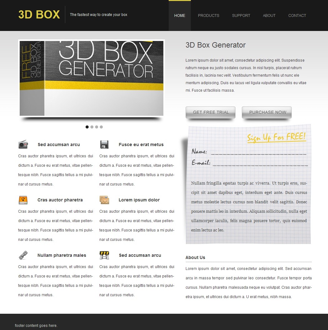
I styled the header 3 with font size set to 14px, line height to 28px, 1px dotted border with color set to #666 and a bottom margin of 5px. Finally, I styled the paragraph with class “about_us” to have 30px for line height and text alignment to justify. The result should be as the image below.
1 | .container_12 .right_column h3 { |
2 | font-size: 14px; |
3 | line-height: 28px; |
4 | border-bottom: 1px dotted #666; |
5 | margin: 0 0 5px 0; |
6 | } |
7 |
8 | .container_12 .right_column p.about_us { |
9 | line-height: 30px; |
10 | text-align: justify; |
11 | } |
Step 10 – Adding Footer Content and Style
Let’s add the HTML for the footer content.1 | class="footer"> |
2 | class="container_12"> |
3 | class="grid_4"> |
4 | Latest News |
5 | |
6 | Nullam mollis arcu sodales mauris interdum ac rhoncus |
7 | mi imperdiet. |
8 | |
9 | |
10 | Donec aliquam scelerisque est, a sagittis odio vehicula |
11 | Ut facilisis cursus mi. |
12 | |
13 | |
14 | class="grid_4"> |
15 | Recent Tweets |
16 | |
17 | Nullam mollis arcu sodales mauris interdum ac rhoncus |
18 | mi imperdiet. 12 minutes ago |
19 | |
20 | |
21 | Donec aliquam scelerisque est, a sagittis odio vehicula |
22 | Ut facilisis cursus mi. 12 minutes ago |
23 | |
24 | |
25 | class="grid_4"> |
26 | Get Connected |
27 | class="connected"> |
28 | Nullam mollis arcu sodales mauris interdum ac rhoncus |
29 | mi imperdiet. |
30 | |
34 | |
35 | |
36 | |
tag with two paragraphs. The second one is the same as the first with the exception of a span inside the paragraph and the final division with an
tag, a paragraph and the social icons links and images. Now, let’s add the CSS style for the footer content.
1.footer .container_12 h3 {
2 color: #fff;
3 font-size: 18px;
4 font-weight: normal;
5 margin: 0 0 20px 0;
6}
7
8.footer .container_12 p {
9 text-align: justify;
10 line-height: 18px;
11 border-bottom: 1px dotted #666;
12 margin: 0 0 10px 0;
13 padding: 0 0 10px 0;
14}
15
16.footer .container_12 p.connected {
17 border: 0px none;
18}
19
20 .footer .container_12 p span {
21 color: #e0cf39;
22 font-size: 10px;
23 }
24
25.footer .container_12 a {
26 margin: 0 8px 0 0;
27}
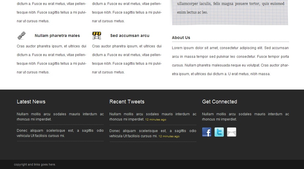
I styled the header 3 with white font color, font size set to 18px, normal font weight and a bottom margin. I styled the paragraph style with justified text alignment, line height set to 18px, 1px dotted bottom border with color set to #666, a bottom margin and a bottom padding. Then I styled the “connected” paragraph with no border and the span inside the paragraphs with color set to #e0cf39 and font size set to 10px. and then I styled the links to have a right margin. The result should be as the image below.
1 | .footer .container_12 h3 { |
2 | color: #fff; |
3 | font-size: 18px; |
4 | font-weight: normal; |
5 | margin: 0 0 20px 0; |
6 | } |
7 |
8 | .footer .container_12 p { |
9 | text-align: justify; |
10 | line-height: 18px; |
11 | border-bottom: 1px dotted #666; |
12 | margin: 0 0 10px 0; |
13 | padding: 0 0 10px 0; |
14 | } |
15 |
16 | .footer .container_12 p.connected { |
17 | border: 0px none; |
18 | } |
19 |
20 | .footer .container_12 p span { |
21 | color: #e0cf39; |
22 | font-size: 10px; |
23 | } |
24 |
25 | .footer .container_12 a { |
26 | margin: 0 8px 0 0; |
27 | } |
Step 11 – Adding Copyright Content and Style
Let’s add the HTML content for the Copyright text and links.1 | class="copyright_links"> |
2 | class="container_12"> |
3 | class="grid_4"> |
4 | Copyright 2010 3D BOX, All Rights Reserved. |
5 | |
6 | class="grid_8"> |
12 | |
13 | |
14 | |
1 | .copyright_links .container_12 .grid_4 { |
2 | text-align: left; |
3 | } |
4 |
5 | .copyright_links .container_12 .grid_8 { |
6 | text-align: right; |
7 | } |
8 |
9 | .copyright_links .container_12 .grid_8 a { |
10 | color: #9e9e9e; |
11 | margin: 0 0 0 15px; |
12 | } |
If you followed this tutorial correctly then you should have a full working HTML/CSS layout from a PSD that looks exactly like this.

Conclusion
So that’s it. In this tutorial you learned how to convert a layout from PSD to a fully working HTML/CSS website, don’t forget to validate and check for browser compatibility (the layout will not validate because of Javascript & CSS3 styles, remove both to validate properly). If there was a part of this tutorial you didn’t understand, or you have a better technique, please be kind and say something in the comments below.
Convert Your Product Landing Page From PSD to HTML [Very Detailed]
![Convert Your Product Landing Page From PSD to HTML [Very Detailed]]() Reviewed by BloggerSri
on
12:56 AM
Rating:
Reviewed by BloggerSri
on
12:56 AM
Rating:

No comments:
Post a Comment